Restore your youthful appearances and enhance your life

Aestheria

Booking appointments made easy through responsive UI design

The Challenge

The website of Aestheria had issues regarding their appointment booking functionality and features. This was a big problem as the client needed to generate more leads through the website’s booking form to improve their scope for showcasing their services and attract more customers.

The Solution

Discover -

We started off this project by surveying the existing website in detail. Upon our finding we were able to get a clear picture on why the existing website for Aestheria was failing to generate leads. First off, the website was lacking in its aesthetic appeal. This being a website for a medical cosmetology clinic, the aesthetic allure and appeal was important. Secondly, the number of fields for forms were more than what was required, and it also did not have an auto-fill option. The third issue with the website was it lacked an interactive and prompt window for chat. All the essential aspects that make for an effective lead generation landing page, the website lacked in most of them.

Define -

Now that we had clear idea of what the existing Aestheria as lacking in that resulted in their low rate of lead generation, we started the definition phase of our development process. Since the point of lead generation is to provide something in exchange for the contact information of the people, it was important that we start off with value proposition mapping. Since the website was for a medical cosmetology clinic, their target audience would mostly be women. So keeping the value proposition language simple and captivating was important. Next the tone of the UI design had to exude beauty and aesthetic appeal. The form filling procedure had to be easy with the minimum number of fields.

Design -

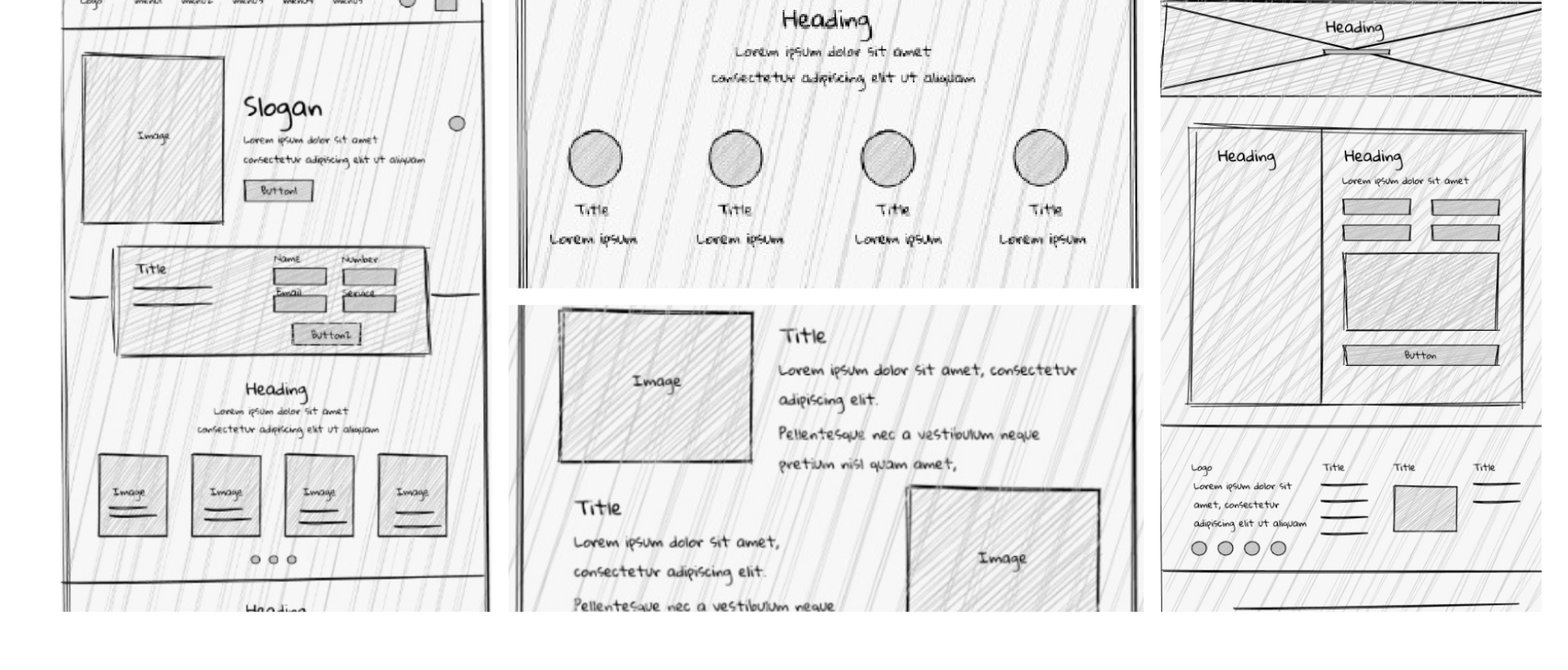
To get the design phase of the website underway, our design team started with a few rudimentary designs with different color combinations that would reflect the brand most effectively. When creating the wireframe for the site we incorporated a chat window that would allow prompt interaction with the users. Created a lead capture form for only the most necessary customer information (name, phone number, email address and service). Made the CTA (call to action button) simple, straightforward and responsive. When we were satisfied with the wireframe we moved on to build the prototype.

Deliver -

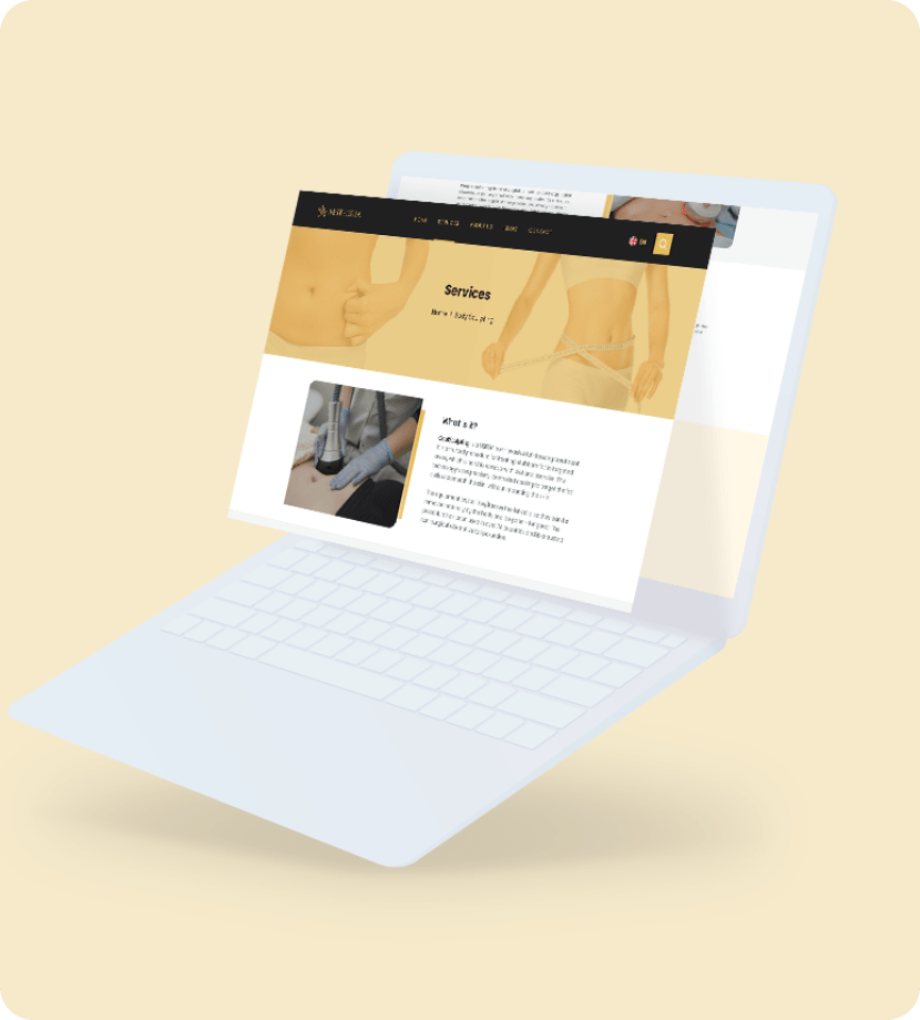
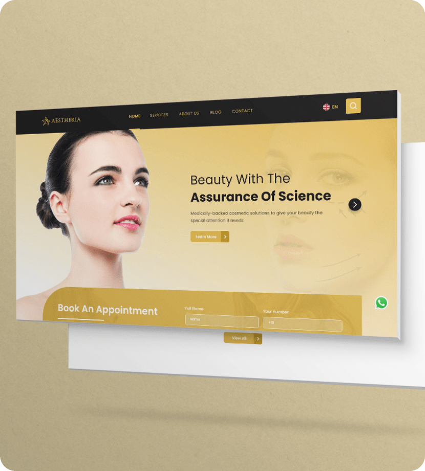
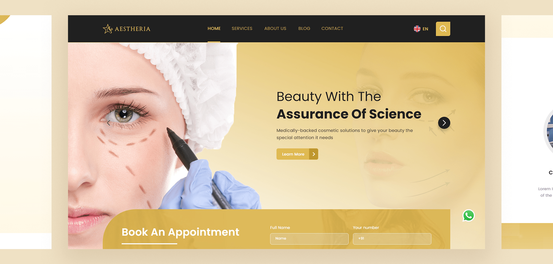
Following the successful testing and validation of the prototype, after a total and comprehensive revamping and optimization of the Aestheria landing page. Now the website's appointment booking system works flawlessly and our UI/UX design has added more flair and aesthetic appeal to the Aestheria website.

  • Client:Aestheria
  • Timeline:03 Month
  • Business type:Healthcare
  • Software:Adobe XD, Figma
  • Location: India
  • Technology: WordPress, Bootstrap

WireFrame

UI

TYPOGRAPHY

Aa

Poppins

Aa Bb Cc Dd Ee Ff Gg Hh Ii Jj Kk Ll Mm Nn Oo Pp Qq Rr Ss Tt Uu Vv Ww Xx Yy Zz
0 1 2 3 4 5 6 7 8 9
Bold

Aa

Poppins

Aa Bb Cc Dd Ee Ff Gg Hh Ii Jj Kk Ll Mm Nn Oo Pp Qq Rr Ss Tt Uu Vv Ww Xx Yy Zz
0 1 2 3 4 5 6 7 8 9
Regular
UI

COLORS

#202020

#FAF0E7

#F99137

#707070

#C1982B

#FFF8E6