Cultivating culture of engagement

TW Challance

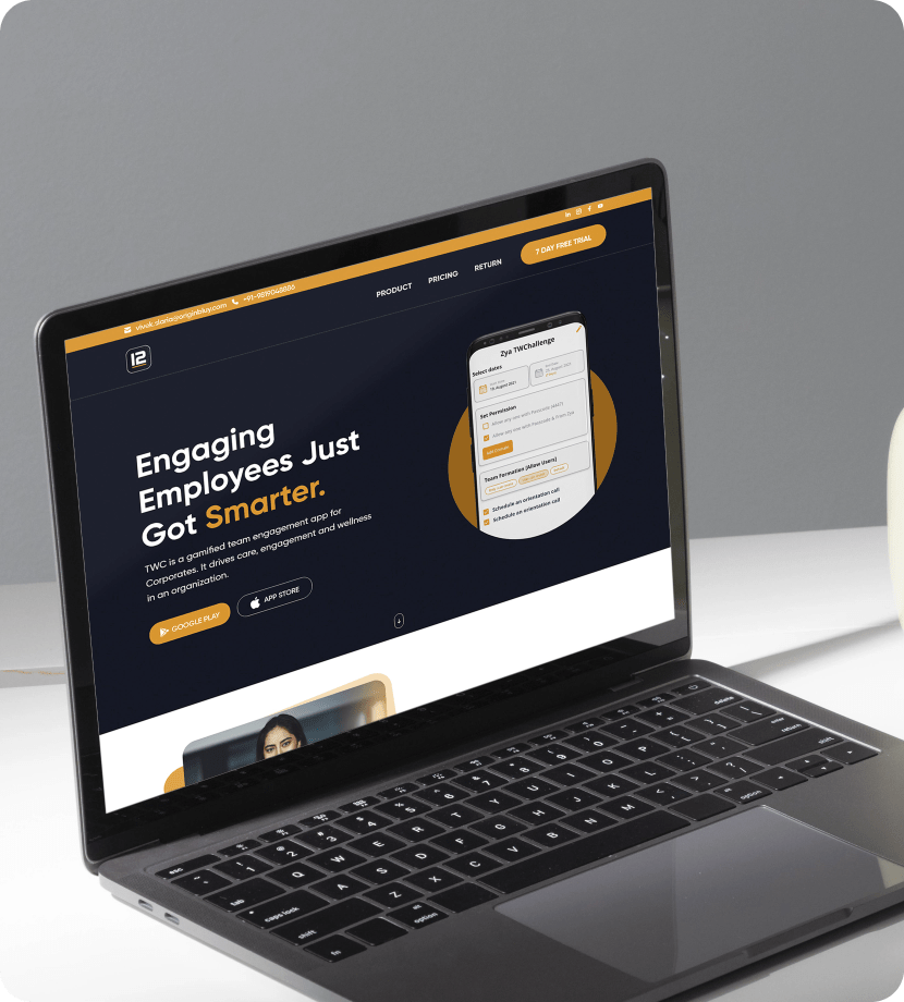
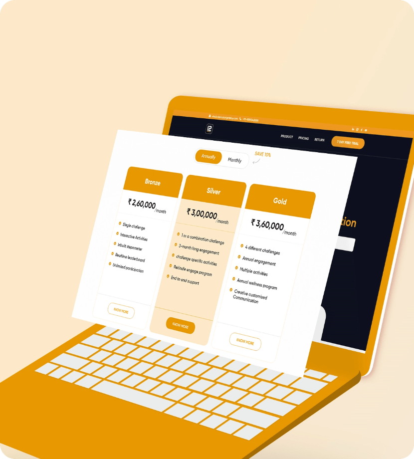
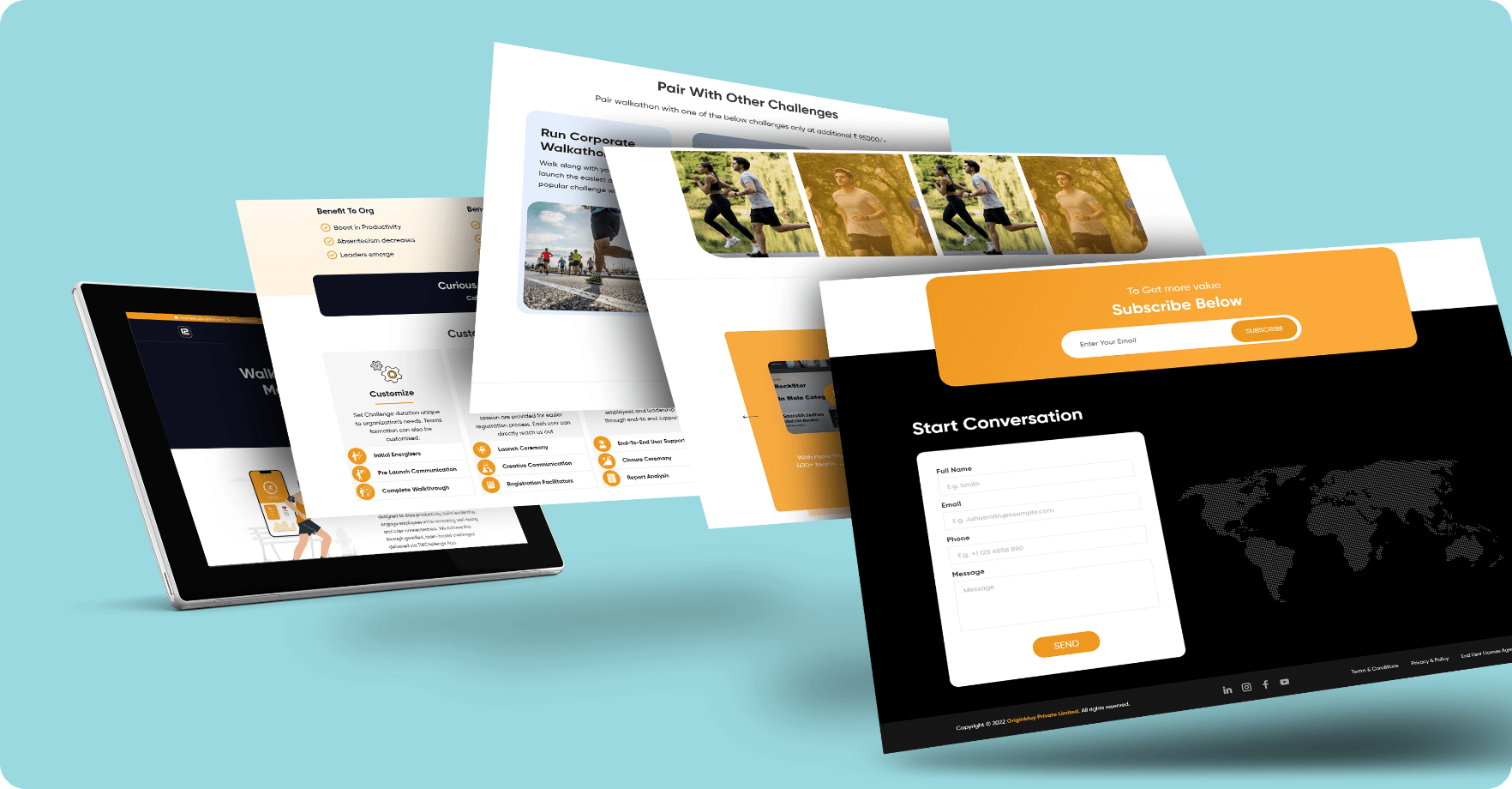
A modern and professional outlook website appearance using UX design

The Challenge

The client being a business enterprise that specialized in providing gamified team engagement apps solutions for corporate employees, they wanted a website that would reflect their brand and services in the best manner possible. So the client's requirement for the website was a user interface design that showcased a professional, corporate and modern outlook that would make for an appealing user experience.

The Solution

Discover -

To be able to meet client’s expectations, our design team first started with basic the needs and requirements of the website. The website’s user interface had to be designed with the target audience in mind. This meant a design with a sleek, professional and modern look and feel. The design had to reflect the client’s core values in terms of wellness and active engagement of corporate employees. Before beginning our work on the design, we sat down with the client and discussed ideas and concepts.

Define -

Following our extensive research on the project, the target audience, and the specialized criteria of service the client would be providing to their customers our design team discussed design concepts and ideas. Since the target audience of the website was corporate organizations and employees it was vital to adapt our design for short attention spans. The average human attention being 8 to 12 seconds, we had to incorporate design that was minimalistic but engaging. Keeping it simple and compelling was the main focus of our user interface design, which would cater to providing users with relevant information in the shortest possible span of time.

Design -

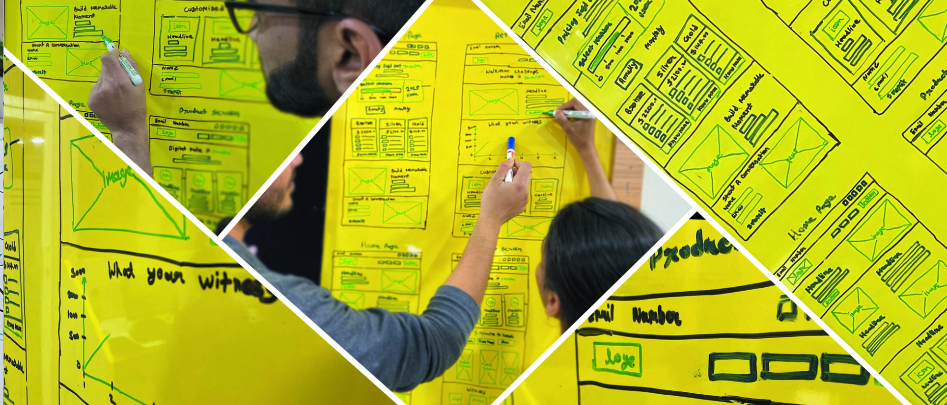
When it comes to UI design, there is no one universal UI design process. One design process cannot be applied for all projects. This project required a professional and a minimalistic UX/UI design. So keeping the project requirement in mind we had sketches done keeping only necessary elements and content that supported user tasks. The color palette had to reflect the concept for the existence of the website. The font for the content had to be sleek and exude professionalism. With these design themes in mind, we worked the wireframe for the website that would be sleek and reflect professionalism in all aspects of the website design. Following the completion of creating a low-fidelity wireframe for the website, we surveyed the design from all UI design specifications so that it would provide for an engaging and impactful user experience. Once we were satisfied with our wire frame, our design team proceeded with building a prototype for the website.

Deliver -

Following the testing of the usability and features of the website, and after the final scrutiny of the structural and dynamic markups, we were able to deliver an end product that met the client’s satisfaction. The website had the professional and minimalist look and feel and at the same time the user interface compelling and engaging enough for a meaningful user experience. With an intensive definition of the client’s requirements and needs our team was able to deliver a corporate website that met the target audience and the business expectations.

  • Client:TWChallange
  • Timeline:01 Month
  • Business type:Fintech
  • Software:Adobe XD, Figma
  • Location: India
  • Technology: WordPress, Bootstrap

WireFrame

UI

TYPOGRAPHY

Aa

Gilroy

Aa Bb Cc Dd Ee Ff Gg Hh Ii Jj Kk Ll Mm Nn Oo Pp Qq Rr Ss Tt Uu Vv Ww Xx Yy Zz
0 1 2 3 4 5 6 7 8 9
Bold

Aa

Gilroy

Aa Bb Cc Dd Ee Ff Gg Hh Ii Jj Kk Ll Mm Nn Oo Pp Qq Rr Ss Tt Uu Vv Ww Xx Yy Zz
0 1 2 3 4 5 6 7 8 9
Regular
UI

COLORS

#ee9820

#0c0f1d

#211718

#f1f1f1