Dive into the hassle free world of sheet music

FlipFolder

User navigation made easier with seamless user interface and creative navigation design.

The Challenge

Digitization of the sheet music. A leading and state-of-the-art sheet music software for college marching bands. A digital flip folder app that allows band directors to share music and conduct the band on the go using smartphones and tablets. Selecting music and rehearsals is not a hassle anymore with seamless, instant and paperless communication.

The Solution

Discover -

To begin with the Fililo design team sat with the client to understand the main issues with the app and get a better insight of the core Flipfolder application. During this discovery phase the design team wanted to understand the interface and navigation problem from the user perspective. The end-user perspective would help us define, design and deliver a more efficient and user friendly interface than the existing one.

Define -

To define the interface and better navigation requirements, the Fililo team collaborated with the original developers of the Flipfolder application. This collaboration with the original developers yielded better than expected results in terms of understanding the source of the problem and the vision for the solution. The interface and the navigation of the app needed to be smooth and seamless offering a more engaging and easy user experience. In order to gain more knowledge and insight how the user interface and navigation of the app could be made better, our team carried out extensive research on the existing and similar sheet music app. There were very few sheet music app in the market, but it helped us to define the things not to include or feature in our design.

Design -

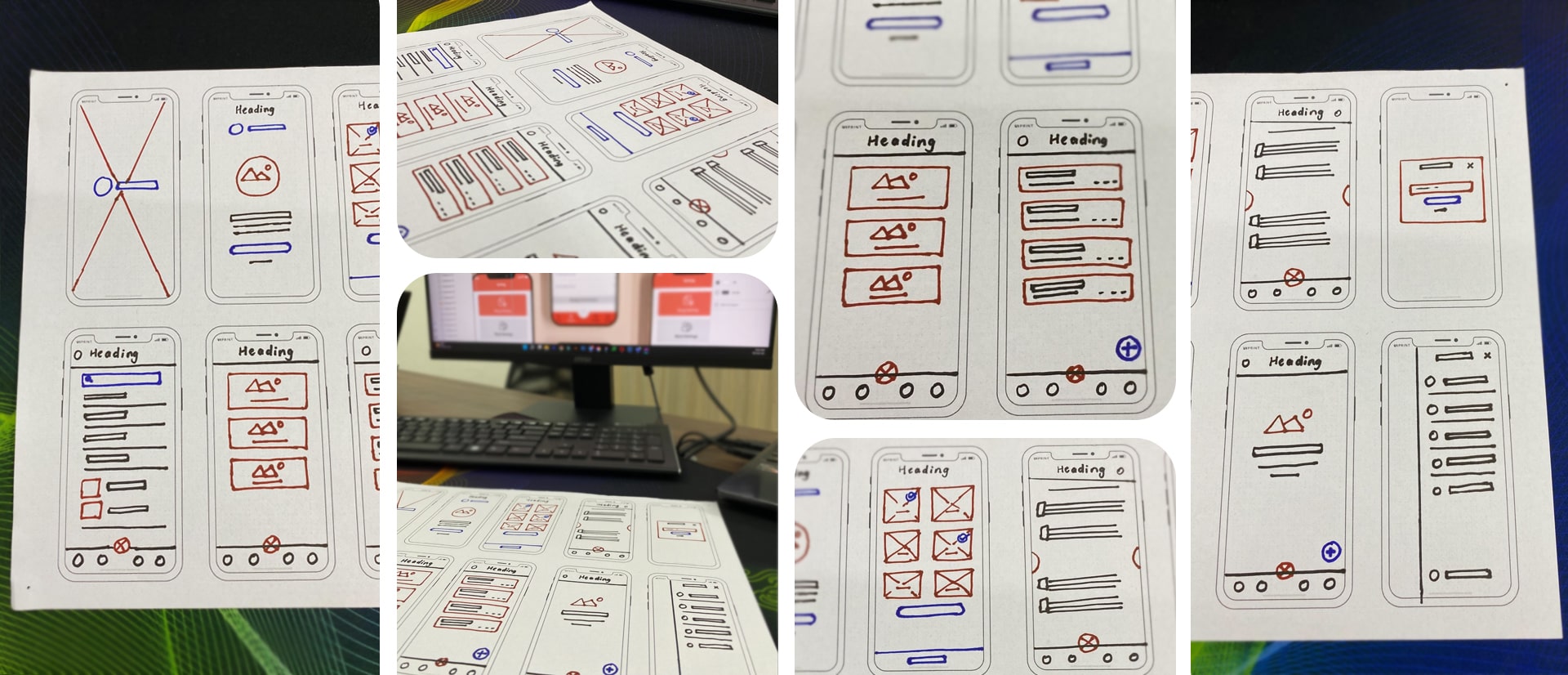
For the design we started with a few detailed sketches of what the new user interface and navigation system of the app would be like, with a few brainstorming sessions to our creative juices flowing. Our first design challenge was to find a perfect color palette and design ambience that would embody the app and its concept perfectly. Finding appropriate color combinations and interface and navigation design structure would give the app a feel of oneness and exclusivity. Moreover, the main focus of the design was to make the app simple and straightforward for the end users without compromising the overall aesthetic appeal of the app.

Deliver -

With a simple and a user-centric approach with focus on seamless and smooth mobile responsiveness in terms of user interface and navigation. We were able to design, develop and deliver an end product without conceding on the core platform and the appeal of the app. We are able to work our way through the overall UX navigation design of the app and completely redesign the navigation functionality of the app which now lets users jump from one feature of the app to another seamlessly and without any latency issues. It was already a good app, our Fililo team just made it better in terms of UI/UX design.

  • Client:FlipFolder
  • Timeline:02 Month
  • Business type:Music Industry
  • Software:Adobe XD, Figma
  • Location: USA
  • Technology: WordPress, Bootstrap

WireFrame

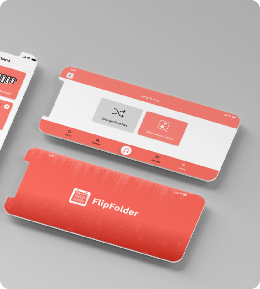
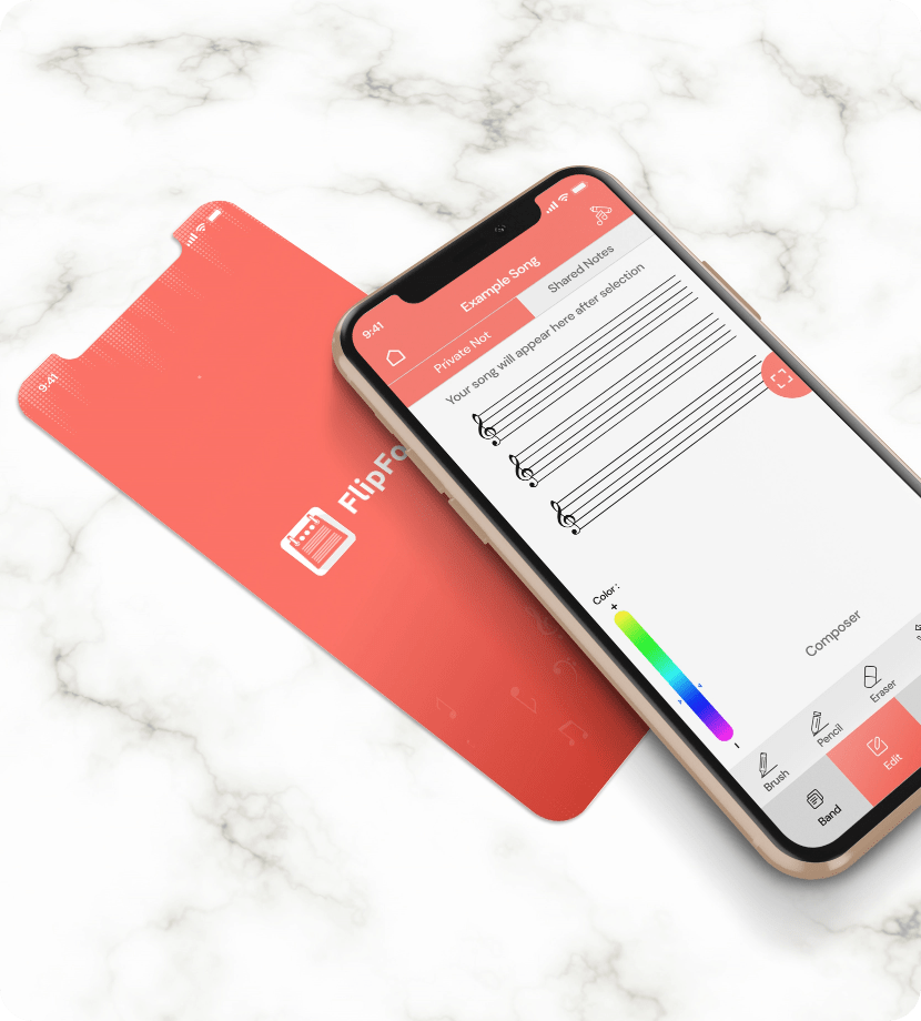
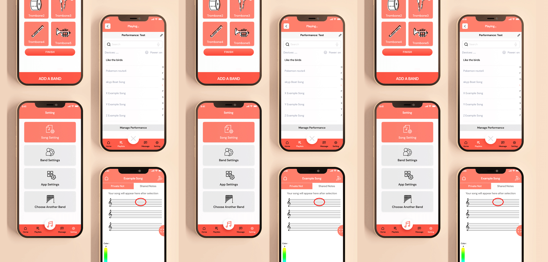
UI

TYPOGRAPHY

Aa

Montserrat

Aa Bb Cc Dd Ee Ff Gg Hh Ii Jj Kk Ll Mm Nn Oo Pp Qq Rr Ss Tt Uu Vv Ww Xx Yy Zz
0 1 2 3 4 5 6 7 8 9
Bold

Aa

Montserrat

Aa Bb Cc Dd Ee Ff Gg Hh Ii Jj Kk Ll Mm Nn Oo Pp Qq Rr Ss Tt Uu Vv Ww Xx Yy Zz
0 1 2 3 4 5 6 7 8 9
Regular
UI

COLORS

#F15C50

#FFFEF4

#1C4453

#303A4B