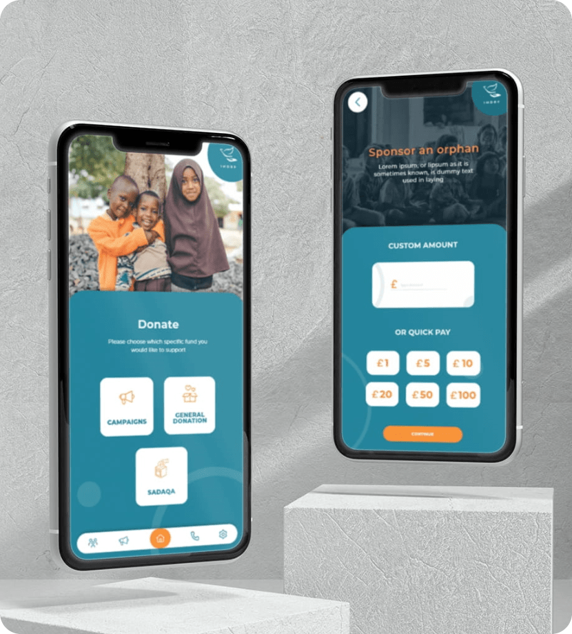
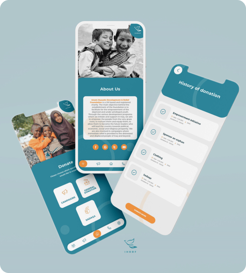
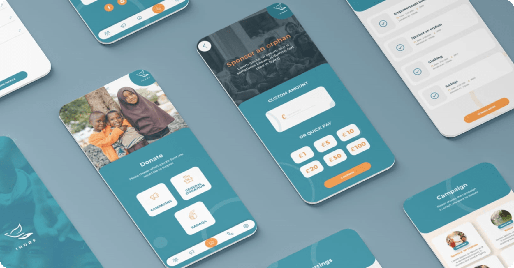
Donation made easier through IHDRF

IHDRF

Humanitarian donations are made easier through design.

The Challenge

IHRDF App being a donations app, meaning using this app people could make donations towards the fund. However, in the existing app making donations required to go through many steps than was required. So because of this people were put off or reluctant to make donations. So the challenge was to make donations possible using the app with a very limited number of steps involved.

The Solution

Discover -

To start off we carried out extensive research on other such payment applications like GooglePay, PayTM, Apple Pay and payment apps for banks and so on. Comparing the existing IHRDF App to these other payment apps was extremely enlightening. As a UX/UI enterprise this was a learning curve for us as well. So we looked at the best feature in each of these apps that could be incorporated in the IHRDF App to revamp the UI for a more engaging UX and at same time provide the payment solution for the app as well.

Define -

The UI of the app had to be neat and minimal with simplified steps towards making donations. Different ideas and concepts were thrown around, some good and some not worth mentioning. The UI design had to reflect the humanitarian side of the app which would encourage people to make donations with a minimum number of donation steps.

Design -

The design had to include options for card payments and Google Pay and Apple Pay enabled payment options. So focusing on the main challenge we created a user flow chart that reflected the number step a user had to go through to be able to make a successful donation in the existing app.
The challenge here was to eliminate the unnecessary steps required to make the donation without compromising the core functionality of the app. Trying out different UI designs we were able to come up with a viable solution. Then we proceeded with designing the wireframe to get a better perspective of the design. Then we followed it up with the system design to achieve consistency of the UI components with the respective designs. Following the completion of all the UI components we started with the designing of the interface. Then finally we were able to create a prototype to represent the user interface and the donation steps like a finished product.

Deliver -

In this stage we did the final evaluation and inspection of the product before testing. This being our first project for a payment and donation app our team was very excited to find out if our creation worked for real or not. And walla! It worked exceptionally at that. So in the end we were able to deliver the final product in the present form of IHRDF App that makes it possible for people to make donations to the relief fund in 3 short, simple and easy steps. The redesigning of the app added another quotient of UX and aesthetic appeal to the IHRDF App.

  • Client:IHDRF
  • Timeline:01 Month
  • Business type:Non-profit
  • Software:Adobe XD, Figma
  • Location: UAE
  • Technology: WordPress, Bootstrap

WireFrame

UI

TYPOGRAPHY

Aa

Montserrat

Aa Bb Cc Dd Ee Ff Gg Hh Ii Jj Kk Ll Mm Nn Oo Pp Qq Rr Ss Tt Uu Vv Ww Xx Yy Zz
0 1 2 3 4 5 6 7 8 9
Bold

Aa

Montserrat

Aa Bb Cc Dd Ee Ff Gg Hh Ii Jj Kk Ll Mm Nn Oo Pp Qq Rr Ss Tt Uu Vv Ww Xx Yy Zz
0 1 2 3 4 5 6 7 8 9
Regular
UI

COLORS

#208399

#F99137

#ff0000

#002436

#F2F2F2

#FFFFFF