Save time and money with smart investment

SPV Mortgages

User friendliness through UX design

The Challenge

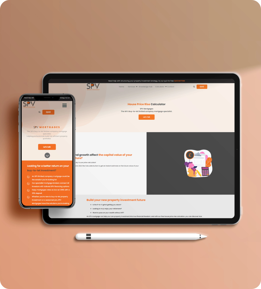
The old website of SPV mortgage company has issues regarding the user interface and as a result was lacking in an engaging and a meaningful user experience. In addition the absence of SEO integration tools within the framework of the website meant that the website and as a result the website was receiving relatively less online traffic. So the challenge here was to design a responsive and free flowing UI for the website that reflected the brand and provided the users with a more compelling UX. And also integrate relevant SEO tools within the framework of the website to boost their online traffic.

The Solution

Discover -

As our first step towards providing a holistic and appealing UX/UI design solution to the challenge, the Fililo team took a detailed view and account of the existing client website. At Fililo, we believe that the solution to the problem lies in the problem itself. So through the comprehensive use of the website from a user perspective, our design time was able to figure out the shortcomings of the website. The website had navigational issues due to a poor UI design and architecture. This under par UI design affected the website’s responsiveness, efficiency and accessibility. The very reason for the users facing user experience issues and the website attracting less online traffic.

Define -

With our extensive research on the project provided us with a better insight on the challenge, the Fililo team had a sit down to discuss the enormity and the complexity of the challenge and how it could be overcome. Through our numerous brainstorming sessions, we were able to figure out that the only solution to the problem was to overhaul the existing SPV Mortgage website and start from scratch. So we sat down with the client, conveyed our findings and discussed the most viable solution for the problem, which was to overhaul the whole website design. Once we got the go ahead from the client, our design team discussed website design ideas and concepts that would be fitting for a mortgage website in terms of both user experience and business requirements.

Design -

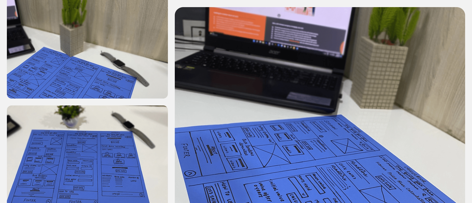
SPV Mortgages being a property and home investment business enterprise we had to make sure that the design and the layout of the website reflected this. Our design team started with few sketches for the website with the most viable solution and reviewed the purpose and objectives of their website, their end product vision and expectations from the website.
Following the sketches, we worked on the wireframe for the website for a better demonstration of what user interface elements will exist on the website’s prominent pages. After the wireframe came the prototype and system design to create a consistent experience across all the pages, functionalities and features of the website.

Deliver -

Once we had the prototype and system design in place, it was time for testing of the prototype. This mainly involved usability tests across all aspects of the website, from its functionalities, features, responsiveness, integration with SEO tools, and user experience. The final assessment of style and font guides, structural and dynamic markup, taking care of the details before sharing the final version of the product with the client. If you visit the SPV Mortgage site presently, you will be able to see our work.

  • Client:SPV MORTGAGES
  • Timeline:03 Month
  • Business type:Real Estate & Property
  • Software:Adobe XD, Figma
  • Location: UK
  • Technology: WordPress, Bootstrap

WireFrame

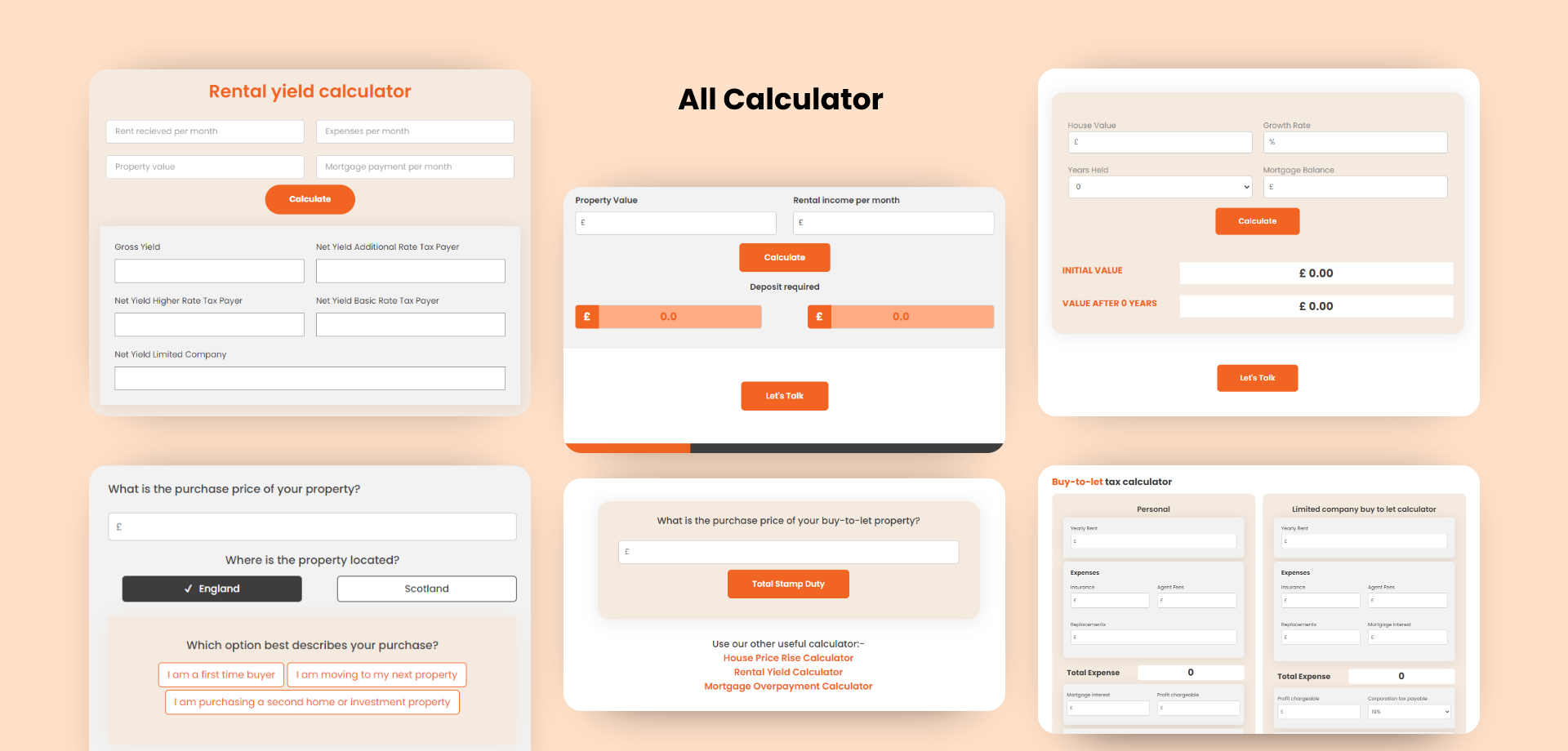
UI

TYPOGRAPHY

Aa

Poppins

Aa Bb Cc Dd Ee Ff Gg Hh Ii Jj Kk Ll Mm Nn Oo Pp Qq Rr Ss Tt Uu Vv Ww Xx Yy Zz
0 1 2 3 4 5 6 7 8 9
Bold

Aa

Poppins

Aa Bb Cc Dd Ee Ff Gg Hh Ii Jj Kk Ll Mm Nn Oo Pp Qq Rr Ss Tt Uu Vv Ww Xx Yy Zz
0 1 2 3 4 5 6 7 8 9
Regular
UI

COLORS

#F16421

#3D3D3D

#F5EADF

#FFFFFF