The Challenge
The client wanted and all inclusive and feature rich UX design for their website. Ironically, the client themselves being an educational and training institute for UX/UI design reached out to us, and we readily obliged.
UX design support for a UI/UX training institute

The client wanted and all inclusive and feature rich UX design for their website. Ironically, the client themselves being an educational and training institute for UX/UI design reached out to us, and we readily obliged.
Client being a UI/UI educational and training firm , the first thing to make sure with the user interface layout needed to have a design with an instructional appeal.. In addition, the website also had to have a vibrancy for an impactful user experience. So while approaching the project we thought in the lines that if the website was one of our what kind of UI design would we want for a meaningful and engaging user experience. For the features to incorporate in the design sat down with the client in order to have a clear and precise idea about the website’s primary needs and requirements. The clients wanted an all inclusive feature rich UI design, which would make for a potent UX.
We started off defining the project by Value proposition mapping. We had to have a clear concept and understand the context and main purpose for the website. The people who will use the website and the reasons why they would use the website had to be crystal clear. Value proposition mapping would help us and clients to find a common ground on the ways to meet the user and the business needs. To be able to create a product that would stand out, we carried out competitive research to better understand the industry standards and identify the prospects for the product.
When we had accumulated enough information and data to work with regarding the
expectation of the website from the user and the business point of view, we moved to
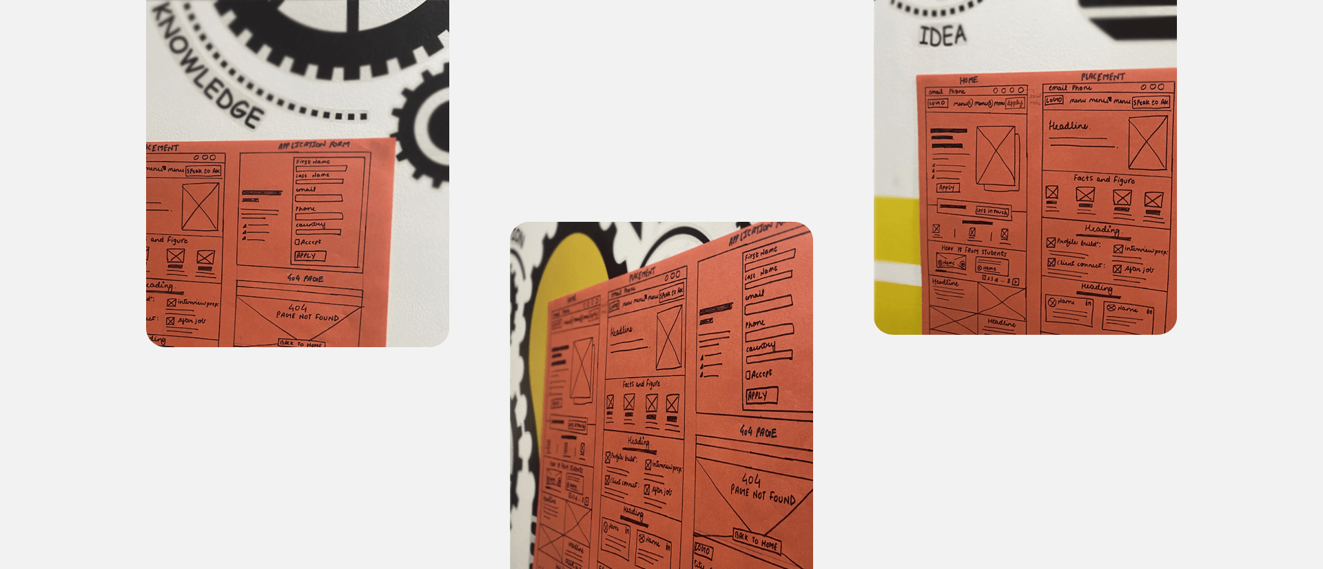
the design phase. We started with a few sketches as it is the most convenient way to
visualize concepts and ideas for the website. Following the sketches, our design
team moved forward with creating the wireframe for a better schematic picture of the
website interface regarding the ideal placements of functional elements and content
on the web page.
While creating the wireframe, we had to ensure that the important elements like user
storyboards, course and placement features of the site were prioritized and placed
in ideal page locations for a more impactful user experience. We started off with
low fidelity wireframes, then moved on to high-fidelity and upon our and the
client’s satisfaction started with the creation of the prototype.
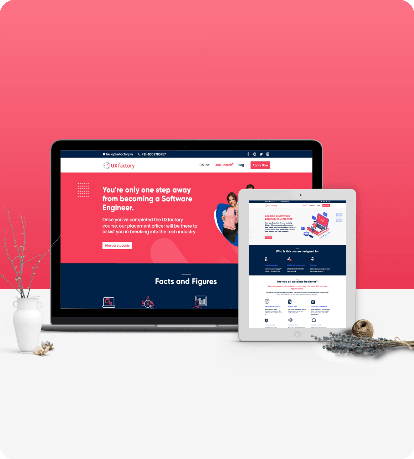
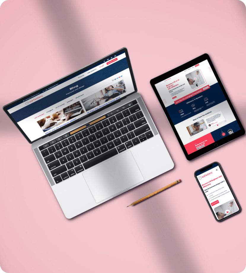
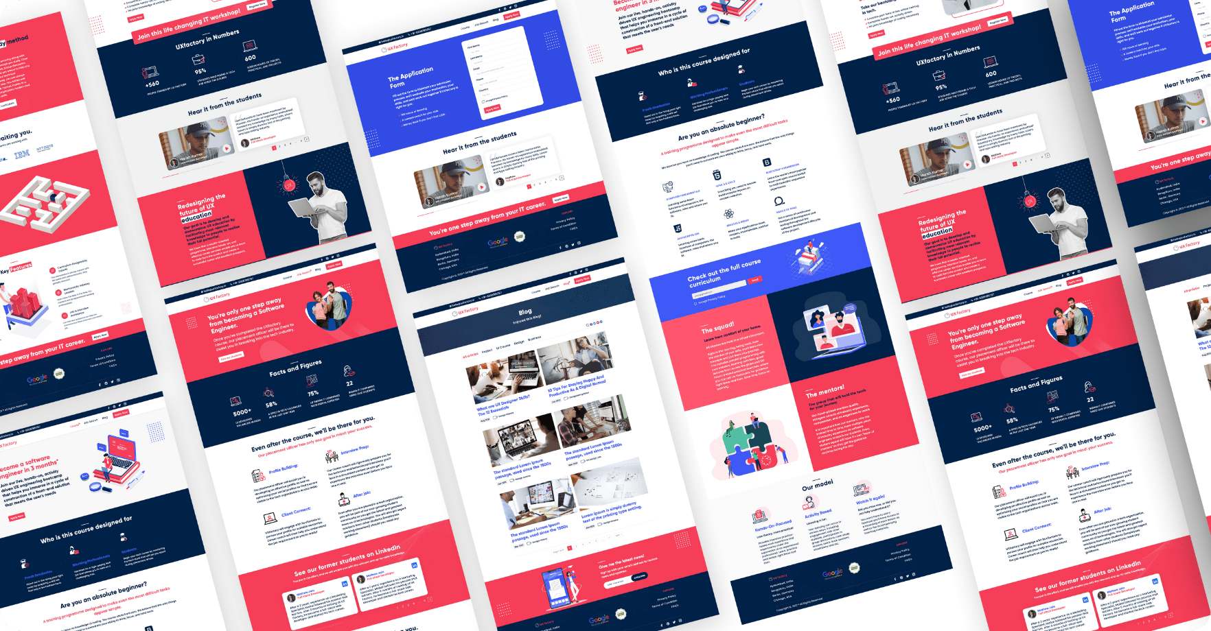
In order to gauge the working of the website before the final delivery, we carried out a series of user testing sessions (as the product was created with focus on it being user-centric). The validation process helped us to evaluate and examine the product from a user perspective and fine tune it on the basis of user feedback. After making the subtle changes and completing routine operation checks on structural and dynamic markups, and performance analysis, we were able to deliver the final version of the website that met the expectation of our client tight to the last detail. A free flowing education and training website with engaging UI for a persuasive UX design.


